August 4, 2008
Posted by Eddie
Review of “Web Form Design, Filling in the Blanksâ€
“Forms suck. If you don’t believe me, try to find people who like filling them in.â€
Are you kidding, I paid for a book that begins like that? My first reaction was that I could have written that! Well I didn’t write it, and I also feel that I got my money’s worth out of Web Form Design, Filling in the Blanks, by Luke Wroblewski.
Forms are hard. I don’t think I need to mention how hard they can be for users… nor do I need to mention what’s at stake if a user finds your form too difficult. Every web developer who doesn’t have his/her head in the clouds should know that. Forms, however, are also very difficult to create… correctly! A well designed form requires a lot of careful, detailed thought. You have so much to consider… usability issues, accessibility issues, and you usually don’t have anything to go on except for your personal experience. This book will help you methodically approach form design, and give you the experience of an expert to guide your decisions.
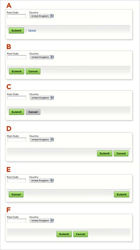
Web Form Design is useful, because Mr. Wroblewski takes a very detailed approach to each aspect of form design. Within each chapter, he thoroughly analyzes the major elements to consider when designing a form.  For example, the chapter on “Actions†is devoted to action items such as submit and cancel buttons. One of the sub-sections discusses where to place these items on the page. The author first presents the reader with the following image demonstrating all of the reasonable placements for the submit and cancel actions.

Using eye-tracking and usability data, he then discusses the pros and cons of each arrangement, without ever deciding one is better then all others. This is key because it lets the reader, knowledge in hand, decide his/her own course of action.
The book is especially valuable because of the user data, eye-tracking data, and case studies presented within. Mr. Wroblewski’s backs his reasoning with either a summary of these tests or with an example culled from his experiences. He reinforces his points with a number of demonstration images, all available from the book’s flickr page. Then he includes a short “best practices†section to close each chapter, outlining what was discussed. These can be used almost as checklists. Interspersed in the text are sidebars which present real-life examples and perspectives from numerous field authorities.
Web Form Design is written well enough so that it can be easily read within a few hours. However, it’s real place is beside you the next time that you have to design or write a form, so that you will be able to make intelligent design decisions, rather than just best guesses.

No Comments Yet
You can be the first to comment!
Leave a comment
You must be logged in to post a comment.